If you have to make a website for a friend or for a customer you try to keep it clean and simple. This tutorial will teach you to make a clean website for a rock caffe. Many people think that this is somehow hard, because it`s about rock. You just have to find pictures related with the theme and pick an appropriate design.
Step 1
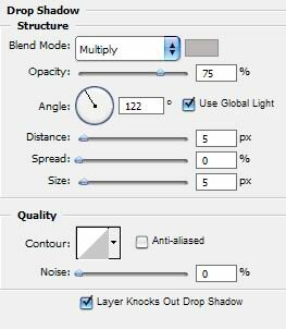
Open a new document 600x400 pixel and fill it with gradient. From dark blue (#4c5975) to light blue (#a8b7d0). Now select your Rounded Rectangle Tool and draw a rectangle in the middle of the document. Go to Layer > Layer Style > Drop Shadow.

Until now the website looks like this:

Step 2
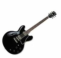
With the Rounded Rectangle Tool draw a rectangle 80 pixels height and the width should have the same size like the white rectangle. Fill it with black. The picture I will use is this:

Resize it as much as you need and drag it into your header. I put it in the right corner.

Step 3
The pictures from the next step are these:


Now take the first image, go to Layer > Layer Style > Stroke. Add a stroke with this color (#dbdbdb) and 3 px. Now safe the new image and drag to the website.

Do the same with the other 2 and place them under the first. Add some shadow like above if you like. I think it looks better with some.

Step 4
This is the content step. A little text for introduction and the 2 most important options with picture under it. You can`t make it without a guitar. I choose this one, cause it`s black and fits great in this website.

The final result after adding text, title and some little pictures:

Filed under Photoshop Tutorials

